Understanding the Basics of Color Psychology

Color is more than just a visual experience; it’s a psychological one that influences mood, behavior, and even decision-making. In home design, the use of color can transform a simple room into a harmonious sanctuary or an energizing workspace. As we step into 2026, understanding the subtleties of color psychology becomes incredibly valuable for anyone looking to revamp their living space.
The Power of Blues and Greens: Creating Calming Spaces
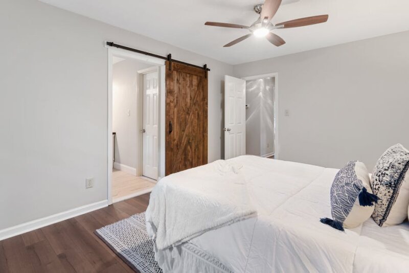
Blue and green shades are often associated with tranquility and nature. These colors are perfect for rooms where relaxation is key, such as bedrooms or lounges. A pale blue, reminiscent of a clear sky, can reduce stress and promote serenity, while a deeper navy can add a touch of sophistication. Similarly, green’s association with nature and growth makes it ideal for creating a refreshing atmosphere. In 2026, consider mixing different shades of these colors to mimic the varied hues of a natural landscape. For instance, using a lush fern green paired with a soft sky blue can bring the outdoors inside, providing a peaceful retreat in urban settings.
Redefining Energy with Warm Tones
Reds, oranges, and yellows are known for their warm, inviting qualities. They are excellent choices for spaces where social interaction and energy are desired, such as kitchens and living rooms. Red, for example, is a bold choice that can stimulate conversation and appetite, making it perfect for dining areas. In contrast, a sunny yellow can brighten a room and evoke happiness, which is why it’s often used in areas with limited natural light. Mixing these hues can create a dynamic yet cozy environment. In 2026, a trending approach is to use these colors as accents—think a bright throw pillow or a vibrant artwork against a neutral backdrop.
Neutral Shades: The Timeless Elegance
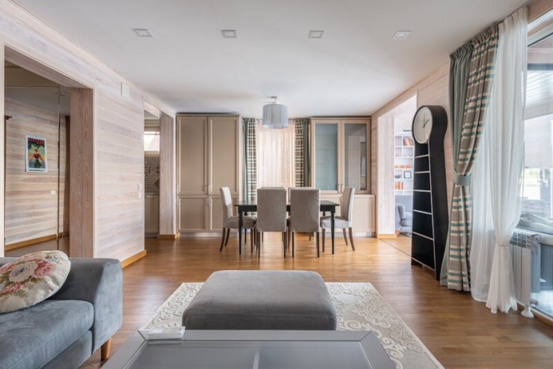
Neutral colors like beige, taupe, and grey remain timeless staples in home design. Their versatility allows them to serve as a canvas for more vibrant colors or to stand alone for a minimalist look. In 2026, the trend leans towards warmer, earthier neutral tones, moving away from the sterile whites of the past. These shades create a grounded feel, offering the perfect backdrop for both traditional and contemporary aesthetics. Pairing neutral colors with natural textures like wood and stone can enhance their warmth, creating a cozy, inviting atmosphere.
The Bold and the Beautiful: Embracing Jewel Tones
Jewel tones are making a significant comeback in 2026. Rich, vibrant colors like emerald green, sapphire blue, and amethyst purple add a touch of luxury and drama to any room. These colors work exceptionally well in spaces meant to impress, such as entryways or formal dining rooms. Jewel tones can be used in upholstery, curtains, or even accent walls to create a focal point. The key is balance; too much can overwhelm, but when used thoughtfully, these tones can make a bold statement.
Practical Tips for Applying Color Psychology in Your Home
- Start Small: If you’re unsure about a color, start with small accents like cushions or artwork before committing to larger pieces like walls or furniture.
- Consider the Room’s Function: Choose colors that match the intended mood of the room. For instance, use calming colors in the bedroom and energizing hues in the kitchen.
- Lighting Matters: Always test your colors under different lighting conditions. Natural light can change how a color appears throughout the day.
- Use a Color Wheel: A color wheel can help you understand how colors relate to each other and how they can be combined effectively.
Final Takeaway: Craft Your Unique Palette
Color psychology in home design is not a one-size-fits-all solution. It’s about understanding how different hues make you feel and using them to create spaces that enhance your lifestyle. Whether it’s crafting a serene retreat with blues and greens or energizing your kitchen with warm oranges, let your personal preferences guide you. As 2026 unfolds, embrace the power of color to transform your home into a space that reflects your personality and meets your emotional needs.